




Most furniture ad campaigns that fail do not fail in the ad. The targeting is reasonable and the clicks arrive at a fair price. Then the shopper lands on a homepage carousel, a grid of two hundred products, or a sale page that never mentions the sofa they tapped on, and they leave. The ad did its job. The page did not.
We see it in almost every account we audit. The store pays for intent and sends it somewhere that was never built to receive it. With Search clicks at a median of 2.10 dollars in the furniture accounts we manage, every visitor who bounces is money spent sending a shopper to the next store on the list.
Here is how we fix it: which campaigns need their own page, what goes on it, how to create urgency without damaging the brand, and how to tell whether it works.
The short answer
Give every ad campaign its own landing page and make that page finish the sentence the ad started. The headline repeats what the shopper clicked, the first image shows the product or room from the ad, the offer and its end date are stated once and clearly, the monthly payment sits beside the price, local proof sits near the top, and there is one obvious next step: book a visit, request a quote or call. Build it for the phone first, track every action as a conversion, and change one element at a time. A campaign page is a salesperson waiting at the door, not a catalog.
Why your homepage is the wrong place to send ad traffic
A homepage serves everyone at once: customers checking hours, people asking about a delivery, job applicants, browsers. It has ten jobs. A campaign visitor has one.
The shopper who clicked an ad for reclining sectionals during your Labor Day sale arrives with specific questions. Is that sectional here, what does it cost, when does the sale end, and can I sit on it this weekend? A typical homepage answers none of those in the first screen, and every tap the shopper needs to find an answer is another chance to leave.
Category grids answer what you carry, not why now or why you. A single product page answers one item when the ad promised a whole event.
The platforms notice too. Google rates landing page experience as one of the three components of Quality Score, alongside expected click through rate and ad relevance, so a page that does not match the search raises what you pay for each click and lowers how often you show. On Meta, a campaign optimizing toward leads or bookings only learns from the people who complete them, so a page that loses visitors starves the system of the signal it needs to find more buyers.
One campaign, one page
The rule is simple. Every campaign that carries a distinct promise gets a page built around that promise. For a single showroom that usually means five page types, not fifty.
The sale event page. Presidents Day, Memorial Day, the Fourth of July, Labor Day, Black Friday. One page per event, built two weeks ahead, carrying the offer, the end date, the featured categories and the showroom details. When the event ends, update or redirect it, never leave an expired offer live.
The category page. Sectionals, mattresses, dining, bedroom, outdoor. A curated page with eight to twelve of your strongest pieces rather than the full inventory, plus the reasons to buy that category from you.
The financing page. For every ad that leads with a monthly payment. What the program is, the terms, how long an application takes and the prequalification link.
The visit or appointment page. For campaigns built to book a showroom visit or a design consultation. Address, map, hours, parking and a short booking form.
The brand page. For people searching your store by name the homepage is often fine, because they already know you. This is the one exception.
Five page types, refreshed through the year, cover nearly every campaign. Our Google Ads playbook for furniture stores lays out the campaign structure these pages plug into.
Message match: the page has to finish the ad's sentence
Message match is the most important idea in landing page work and the cheapest to get right. Within a second of landing, the shopper should know they are in the right place, so four things line up between the ad and the first screen.
The words. If the ad says reclining sectionals for the Labor Day sale, the page headline says reclining sectionals for the Labor Day sale. Not welcome to our store, not shop our collection.
The picture. The sofa in the ad is the sofa at the top of the page. A shopper who tapped a grey modular sectional and lands on a brown leather recliner assumes a bait and switch.
The offer. The same numbers, end date and conditions. If the ad mentions free delivery, so does the first screen, with any conditions beside it.
The action. If the ad says book a showroom visit, the button says book a showroom visit. Not submit, not learn more.
Automated campaigns make this harder. Performance Max and Meta Advantage+ assemble ads from your assets, so build each asset group or ad set around one theme and point it at that theme's page. In Performance Max, check the final URL expansion setting, because left on it lets Google send sale traffic to whichever page it prefers. Our piece on Meta AI ads for furniture stores covers how to organize creative so each theme stays together.
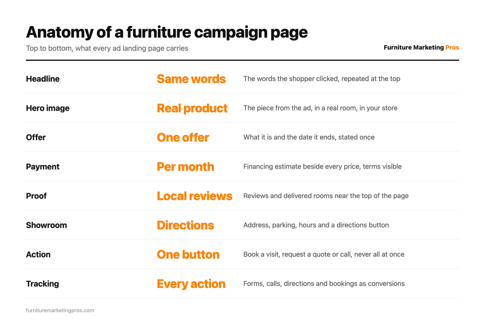
The anatomy of a furniture campaign page, top to bottom
We build campaign pages in the same order every time, because it mirrors the questions a furniture shopper asks.
The first screen. A headline that matches the ad, one line on why you, the real product in a real room, the offer with its end date, and the primary button. Real photos and video beat catalog renders, and on a phone all of this shows before the shopper scrolls.
The products. Eight to twelve featured pieces, each with a price, a monthly payment estimate, a real photograph and honest availability or delivery timing.
The proof. Reviews from local customers, photographs of rooms you have delivered and, if it helps, how long you have been in business.
The showroom. Address, map, hours, parking, a directions button and a storefront photo. The decision is made during online research and the visit confirms it, so make the visit feel easy.
The answers. Short answers on delivery timing and cost, financing, returns or comfort guarantees, and whether the sale price applies in store.
The action, again. The same button at the bottom, so nobody has to scroll back up.
What stays off matters as much. Strip the navigation down to a logo and a phone number. No popup in the first seconds, no newsletter box competing with the main action, no autoplaying sound.
Offers, deadlines and urgency that stay honest
Furniture is a considered purchase, typically two to twelve weeks from first search to purchase. A landing page cannot shortcut that decision and should not try. Its job is to give the shopper a reason to act this week rather than next month.
Real urgency is specific: a sale that ends on a stated date, the last floor model, a delivery date before a holiday, a financing term that closes at month end. Say it plainly, with the actual date, and the shopper believes it.
Fake urgency is the countdown timer that resets on every visit and the sale that never ends. Furniture markets are local enough that shoppers talk, and a store running a permanent clearance teaches the whole town to ignore its deadlines.
Keep to one offer per page. A percentage off, free delivery, a gift and a financing term all at once leaves the shopper remembering none of them. Our post on furniture promotions that drive sales covers how to build an offer worth putting on the page.
And show the payment. Financing presented as a monthly payment beside the price is among the most reliable reasons a furniture ad gets a response. Keep the terms readable and never promise approval.
Trust for a high ticket purchase
A shopper about to spend serious money with a store found through an ad has one quiet fear: that the store is not what the ad suggests. In furniture, the signals that answer it are specific.
- Reviews from local customers, with first names and towns where people agreed, near the top.
- Photos of delivered rooms in customers' homes.
- The showroom itself, something no online brand can show.
- Delivery details: who delivers, how far, and whether setup and removal are included.
- Warranties, returns and comfort guarantees, stated plainly.
- The people: a photo of the owner or the design team.
Built for the phone, tested on the phone
Most people who tap a Meta ad are on a phone, and a large share of Google clicks are too. The phone version is the real page and desktop is the adaptation.
Speed first. Compress every image, drop heavy sliders and keep the first screen light enough to appear quickly on a cellular connection.
Make every contact one tap. A click to call button, an address that opens maps, form fields that bring up the right keyboard.
Ask for the minimum. Name, phone or email, what they are shopping for and roughly when. Everything else can wait for the follow up call.
Test on a real phone over a cellular connection before any traffic goes to it. If your current site makes this hard, that is a web development problem worth fixing before you raise ad budgets, because more spend only amplifies a page that leaks.
Google, Meta and retargeting traffic need different pages
The same sofa draws three different visitors, and each needs a slightly different page.
Google Search visitors are hunting. They typed a category and a city, so give them the answer at once: the product, the price, the showroom and the button. Shorter pages tend to win here.
Meta visitors were interrupted. They were scrolling and saw a room they liked, so they need more story before they act. These pages can run longer and lean on video. Meta's instant forms keep people inside the app and usually produce more leads, while a landing page usually produces fewer, better qualified ones. Test both and judge them on booked appointments.
Retargeting visitors already know you. Sending them back to the page they left repeats a conversation that ended without a sale. Send them to the next step: the appointment page, the financing page, or the product they viewed with delivery timing added. Our retargeting playbook maps which message belongs at which stage.
Track every action, then test one thing at a time
A page you cannot measure is a guess. Track every buyer action: forms, calls through a tracking number, direction taps, bookings and financing application starts. Set each as a conversion in Google Ads and as a Meta event sent through the Conversions API as well as the pixel, because browser tracking lost signal after Apple's App Tracking Transparency in 2021. Accounts with a linked, verified Google Business Profile and enough volume can also use store visits conversions.
Then judge the page like the campaign: on inquiries, booked appointments, verified showroom visits and sales in a CRM, not clicks or time on page.
Testing comes after tracking. Change one element at a time, whether headline, hero image, offer framing, form length or button text, and let each version run long enough to mean something. Spring is the cheapest time to learn. Across the furniture Google Ads accounts we manage, the average April click cost 60 cents against 4.93 dollars in February, so a test that hurts in winter is affordable in April, and the winner carries into the big windows. For the site wide version of this thinking, see how to turn your furniture store website into a lead machine.
Making campaign pages part of every campaign
The stores that get this right treat landing pages as part of every campaign, built alongside the ads, refreshed for every sale window and retired when the offer ends. That is how we run paid ads management for furniture and mattress retailers: the ad, the page, the tracking and the follow up planned as one piece of work. For a second pair of eyes on where your ad traffic lands today, book a strategy call and we will walk through your pages together.
Key takeaways
- Most furniture campaigns lose the sale after the click, on a page that was never built to receive the ad.
- Give every campaign with a distinct promise its own page, which for a single showroom means about five page types.
- Message match is the cheapest win: the same words, picture, offer and action in the ad and on the first screen.
- Use real deadlines and one clear offer, show the monthly payment, and never fake urgency.
- Design for the phone first and test on a real phone over a cellular connection before sending traffic.
- Track every buyer action as a conversion and judge pages on appointments, visits and sales.
Frequently asked questions
Do I really need a separate landing page for every furniture ad campaign?
You need one for every campaign that makes a distinct promise, such as a sale event, a category, a financing offer or a showroom visit. For most single showrooms that is about five page types. Brand searches are the exception.
What should be on the first screen of a furniture landing page?
A headline that repeats the ad, a real photo of the product from the ad, the offer with its end date, and one primary button. On a phone all of that should be visible before the shopper scrolls.
Should my Meta ads use instant forms or a landing page?
Test both. Instant forms usually produce more leads and a landing page usually produces fewer, better qualified ones. Judge them on booked appointments and showroom visits, not form counts.
How long should a furniture campaign landing page be?
As long as it takes to answer the shopper's questions. Search traffic tends to do better with short, direct pages, while Meta traffic often needs more images and video before it acts.
How do I know whether my landing page is working?
Track forms, calls, direction taps, bookings and financing starts as conversions, then compare them with appointments and sales in your CRM. Keep the version that produces more appointments, not more clicks.